最近移动端开发遇到一种布局,固定底部容器,里面有输入框,列表
使用 fixed 很好实现了上面的布局
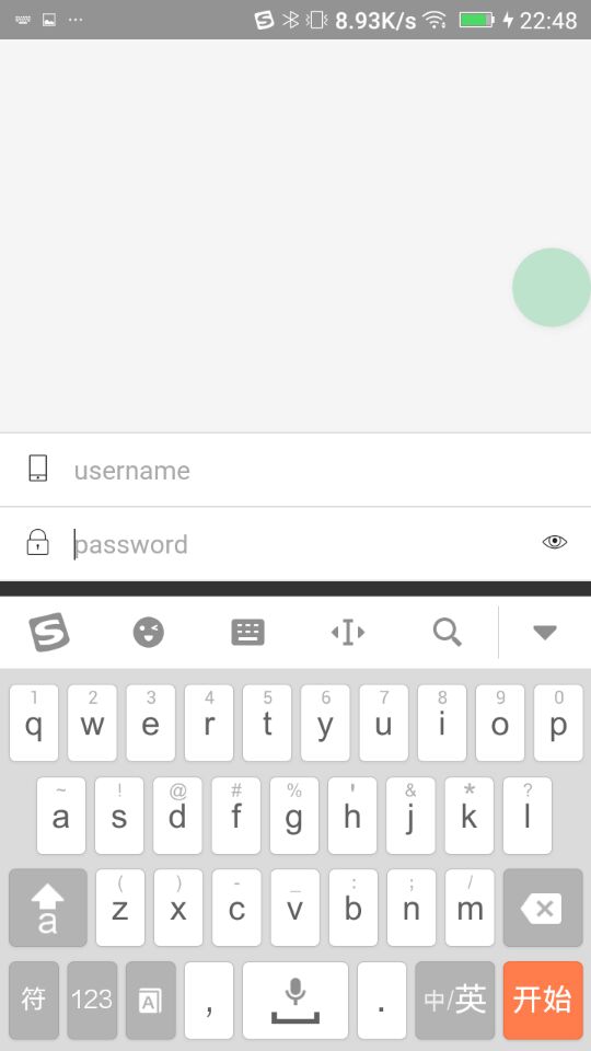
<style> .history-warp { width: 100%; height: 300px; position: fixed; bottom: 0; background: #333; } .history-list { height: 200px; color: white; font-size: 20px; text-align: center; line-height: 200px; } .fixfixed.history-warp { bottom: -200px; }</style> <div class="history-warp"> <ul class="aui-list aui-form-list"> <li class="aui-list-item"> <div class="aui-list-item-inner"> <div class="aui-list-item-label-icon"> <i class="aui-iconfont aui-icon-mobile"></i> </div> <div class="aui-list-item-input"> <input type="text" placeholder="username" /> </div> </div> </li> <li class="aui-list-item"> <div class="aui-list-item-inner"> <div class="aui-list-item-label-icon"> <i class="aui-iconfont aui-icon-lock"></i> </div> <div class="aui-list-item-input"> <input type="password" placeholder="password" /> </div> <div class="aui-list-item-label-icon"> <i class="aui-iconfont aui-icon-display"></i> </div> </div> </li> </ul> <div class="history-list">这是一个可以滚动的列表</div></div>那么问题来了,在 android 上,弹出键盘时候相当于 resize 了整个 windows,结果整个窗口高度会变小,fixed 布局会一直定位在底部,结果会变成这样
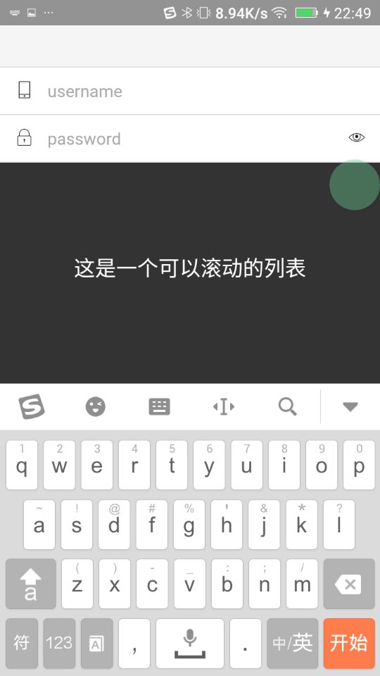
下面的黑色滚动列表也被弹上去了,这不是我们想要的,比较完美的实现应该是这样的
其实还是 resize 的问题,在弹出键盘的时候窗口变小了,而底部 fixed 的元素会向上移动,那么可以在弹出键盘时候改变 fixed 元素的 bottom 值为负数,让 fiexd 元素下移就可以了
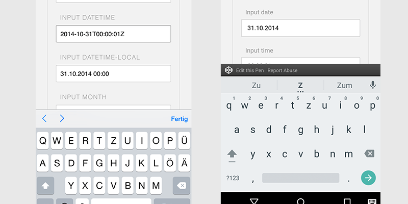
安卓弹出键盘会触发 resize,ios 则不会
可以通过新增一个 fixed class,通过脚本控制样式解决这个问题
.fixfixed.history-warp { bottom: -200px;}var $fixedEl = $('.history-warp');// 实现ios和android同样效果$(document).on('focus', 'input', function () { addClsIfNotExist($fixedEl, 'fixfixed');});$(document).on('blur', 'input', function () { $fixedEl.removeClass('fixfixed');});var nowHeight = $(window).height();// 针对安卓的$(window).resize(function () { var h = $(this).height(); if (nowHeight - h > 200) { // 键盘显示 addClsIfNotExist($fixedEl, 'fixfixed'); } else { // 键盘隐藏 $fixedEl.removeClass('fixfixed'); }}); function addClsIfNotExist($el, clsName) { if (!$el.hasClass(clsName)) { $el.addClass(clsName); }}本文为原创,未经授权,禁止任何媒体或个人自媒体转载
商业侵权必究,如需授权请联系340443366@qq.com

评论